TL;DR: Auth0 is releasing Auth0 Explorer, an experimental tool that helps you to visualize your Auth0 tenant’s overall structure, offering an innovative user interface to zoom out to the big picture or dive into the details of individual applications settings.
At Auth0 we are obsessed with making identity simple for application builders. In our quest to help our customers and the community at large to better navigate the complexity of identity development, we constantly strive to improve existing technologies. Sometimes, however, we tackle problems that call for more radical innovation and bolder experimentation.
Take the “many moving parts” problem. In a nutshell: any identity solution of non-trivial scope is usually composed by a large number of components, all interacting in non-obvious ways and contributing to the solution’s emergent behavior. Your solution will have multiple identity sources, many clients, and API tangled in complex call graphs, custom logic running here and there, authentication and authorization policies scattered across your topology, and so on. Even if you are an identity expert, well-versed in protocols and concepts, you still need to understand the details of that particular solution to work with it. What is the state of the art in our industry to help you navigate that particular flavor of complexity? The available tools haven’t changed for quite some time. Every vendor will offer a management portal of some kind, where you can list artifacts of a given type (applications, trusted identity providers, etc) and dig into the details of individual items, but it’s usually very hard to see the relationships between entities and predict what the overall behavior will be. You can see the trees but not the forest. Using APIs and CLIs to inspect your solution doesn’t yield much better results.
While brainstorming how we could help, we informally observed what coping strategies are most commonly pursued by professionals and newbies alike. And what did we find? Nearly everyone makes a drawing of their solution to make sense of it. Scribbles on a whiteboard or a notepad, diagrams in official specs, no matter the format, pictures of the solution components and the relationships between them play a key role in planning, development, and management - and often are the centerpiece of discussions and decision making.
We already took steps to help crafting diagrams effectively, from providing the raw material (see the identicons clipart collection for identity concepts) to publishing templates and examples (like the Auth0 Engine diagram), but we felt we could do more. We realized that Auth0 tenants already hold all the information necessary to draw a complete picture of your solution, and more… so why should you reverse engineer a diagram when we can generate one for you? That’s how the idea of Auth0 Explorer was born.
Navigating your Identity Solution
Auth0 Explorer is an experimental tool that generates a visual representation of your Auth0 tenant on the fly, arranging in a clear layout all major artifacts (connections, apps, API), representing relationships as a graph, and allowing you to examine every element in greater detail.
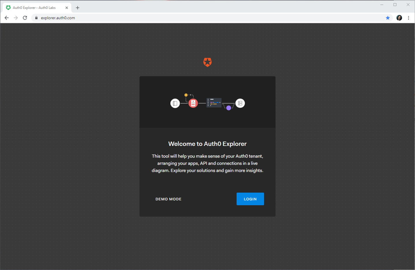
There’s no point in describing Auth0 Explorer any further, the best way to give you an idea is to simply show it in action! Just navigate to https://explorer.auth0.com/. You’ll be presented with an essential landing page.
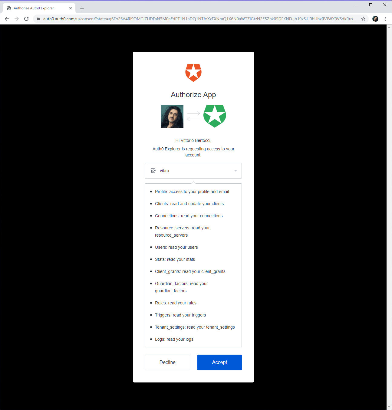
Hit Login and sign in with your Auth0 account. You’ll be presented with a consent page:
The drop-down offers you the chance to select what tenant you want to explore among the ones associated with your user account.
Auth0 Explorer uses the Auth0 Management API, just like any app you might develop by yourself on top of the Auth0 platform. As such, it needs to explicitly ask for consent for reading all the tenant entities it will display. Hit ‘Accept,’ and you’ll land on Auth0 Explorer’s main page.
Grasping the Big Picture
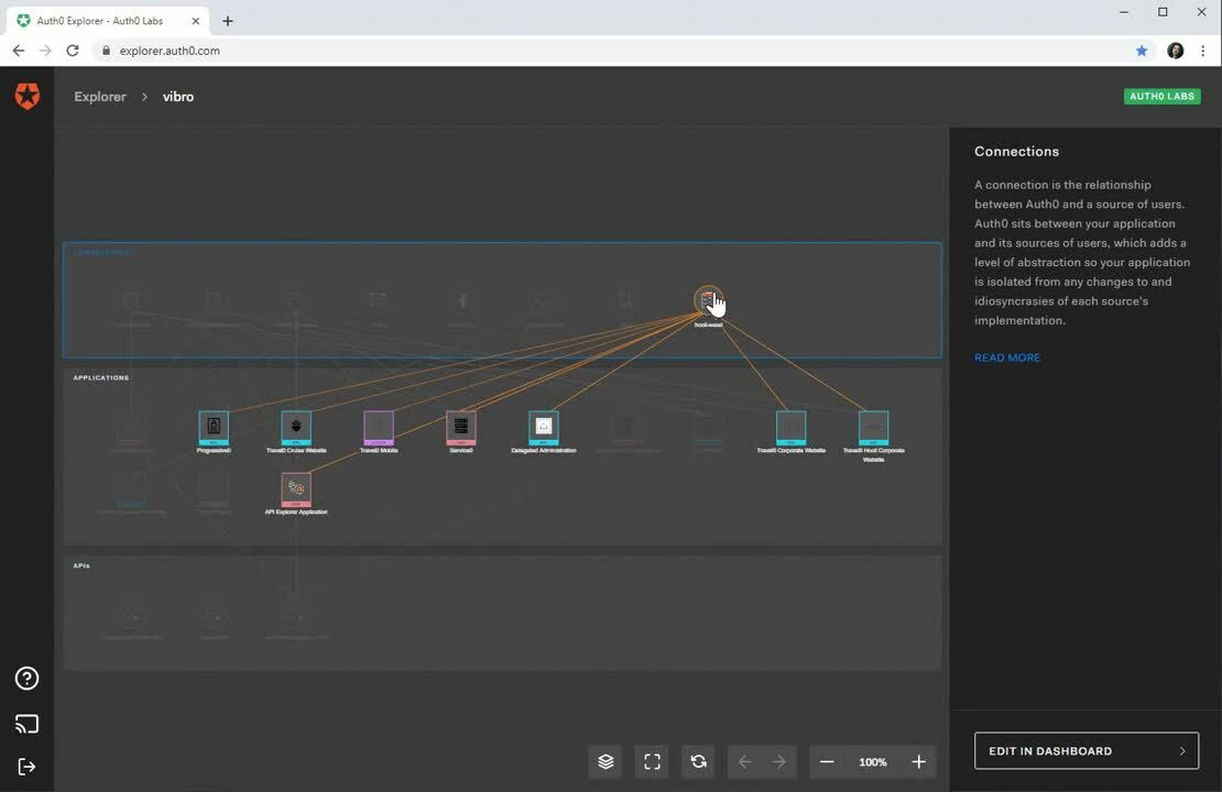
What you will see is a full diagram of the Auth0 tenant I selected. The top row contains all the connections configured for the tenant. The middle row lists all the applications registered, conveniently color coded to clarify the client type (web app, native client, etc). The bottom row lists all the tenant’s API, including Auth0’s built in ones.
Not only you can see all the main actors in a single representation: if you hover on the individual connection icons, you’ll immediately see what applications are configured to accept identities from them! In the video above you can immediately see what providers are used by many apps, which ones are configured but not used at all, and everything in between.
If you hover on an application icon, you’ll navigate the graph in the opposite direction, making it immediately obvious what identities are accepted for a given application – and what API that application is configured to invoke. That’s pretty neat! The structure of your tenant is laid bare in front of you.
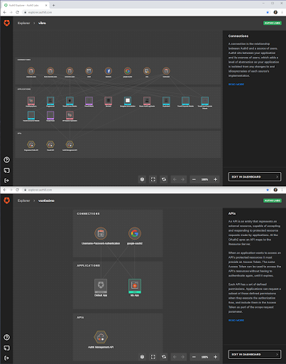
Here’s another example of the potential of Auth0 Explorer for making sense of your solutions. Have you ever tried to compare tenants, or to find out whether your dashboard is open on the tenant you need to work on. Sure, there’s the name visible on the top right…but compare it with the immediate, intuitive insight you get when you visualize two different tenants in two different instances of Auth0 Explorer:
Telling which tenant is your production environment and which one is just being used for experiments becomes blindingly obvious.
Here’s another example of “big picture” insight that becomes possible with Auth0 Explorer. Take a look at the following video.
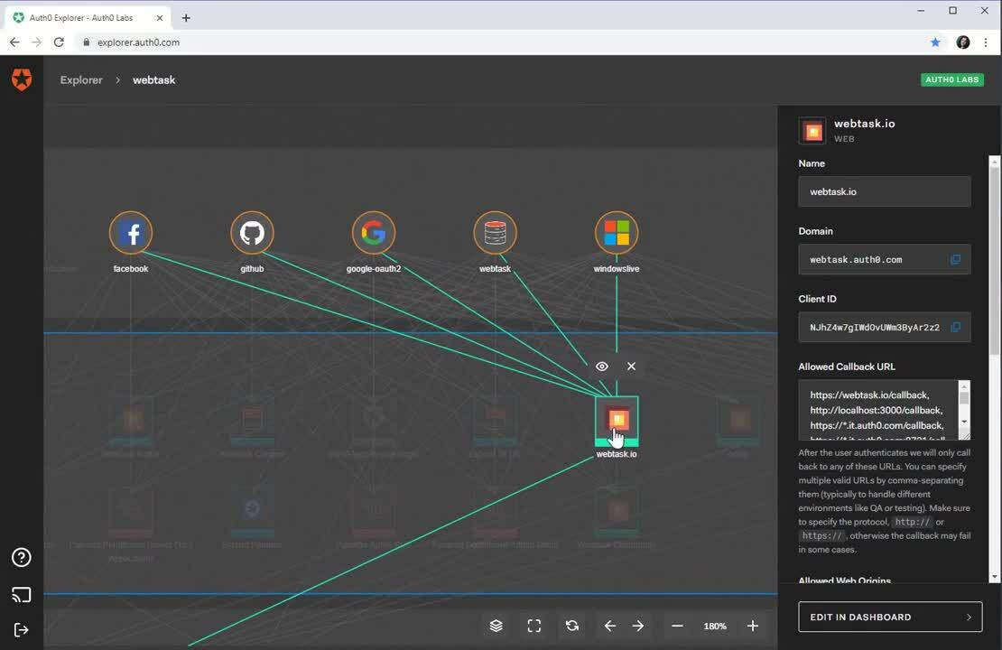
In this particular case, I am turning on the traffic layer – which has the effect of varying the thickness of the line connecting an app to an identity provider according to the amount of traffic that IdP generates for the application, as recorded in Auth0 logs. Here you can clearly see that the lion’s share for this app comes from GitHub, followed by Facebook.
Remember, we are still at the experimental stage with Auth0 Explorer: this is just one example of the kind of insight we could offer you in this view, and we are looking forward to your feedback on both visualization style and data layers you’d like to see available here.
Examining Individual Entities
Once you’ve found your bearings within the tenant, Auth0 Explorer helps you to dig into the details of any of the artifacts displayed in the diagram. The following video shows you a concrete example of that.
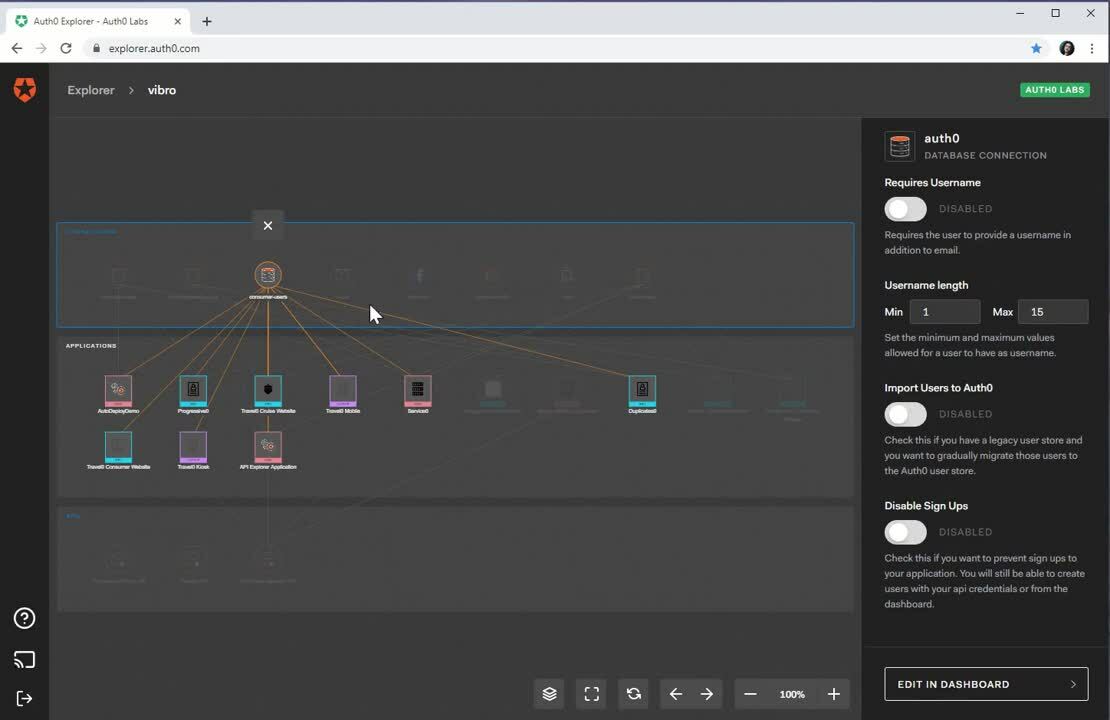
Whenever you click on an icon, Auth0 Explorer uses the pane on the right to display the attributes of the corresponding entity. In the video above I select the Google connection, a custom DB connection and one SPA – and every time, the right pane shows me the corresponding details. Whenever I decide I want to edit the entity I am examining, I can always click the Edit in Dashboard button and be deep-linked to the corresponding Auth0 Dashboard page. In the example here I do so for a SPA. Any changes will be automatically picked up by Auth0 Explorer at the next refresh.
Understanding Applications’ Behavior End-to End
Excited yet? Well, hold on to your hats, because the surprises aren’t over yet! We tackled the problem of working at the tenant level, but there’s still a lot we can do at the single application level.
Even the best identity experts cannot simply glance at a list of application attributes (such as the ones displayed in a typical dashboard: client_IDs, return URLs etc) and anticipate how the application will actually work at run time. There are lots of moving parts and service features all contributing to the actual application behavior, and a bunch of text labels just isn’t expressive enough to communicate a complex ensemble of features in immediate, intuitive way.
By simply double-clicking on an application icon, you can experience how Auth0 Explorer tries to address that challenge with a novel approach.
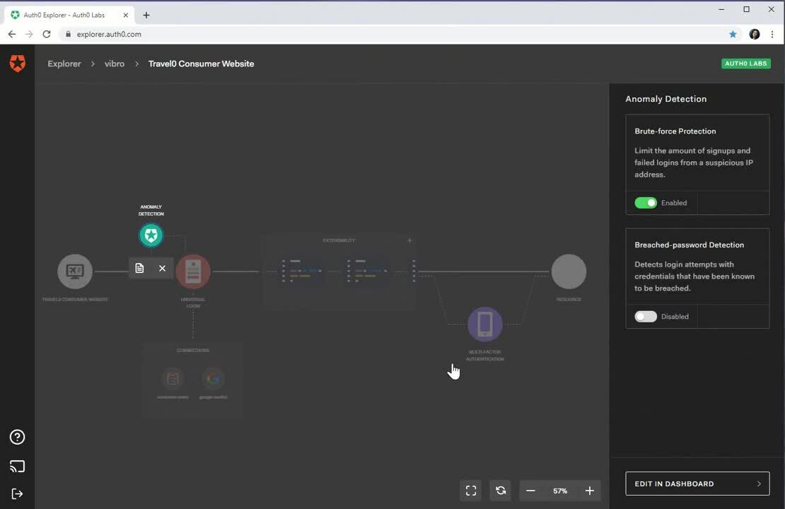
What you see in the GIF above is a representation of the journey of an authentication request, placing on its path all the Auth0 features you can use to customize its behavior.
Going from left to right, you encounter the Anomaly Detection stage, the Universal Login stage (with associated set of identity providers configured for this particular app), the extensibility block (more on that in a minute) and the multi factor authentication stage.
Each feature is represented by an icon that can be either grayed out (if the feature is disabled) or lighted up in color (if the feature is on). Consistently with the affordances you already encountered in the tenant level diagram, you can click on every icon to find details in the right pane. When you click the Universal Login icon you get an actual preview of what the authentication experience will look like: and if you want to explore that aspect further, Auth0 Explorer offers you a direct link to Auth0 Flows, where you will be able to examine how different user journeys will look like - automatically configured to use logo, colors, and backgrounds from your tenant settings.
If you are using Auth0, chances are that your app takes advantage of our advanced extensibility capabilities - namely, the ability to inject your own Node.js code and execute it directly within our authorization pipeline. That’s an incredibly powerful feature, but it is not always immediately intuitive to keep track of its influence within the context of all the other features.
Yep, you called it! Auth0 Explorer does something for this scenario too. You just need to click on the Extensibility block in the Application View to find out.
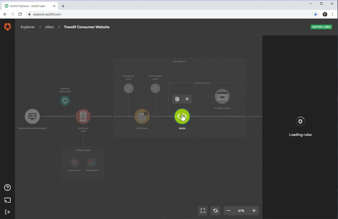
Once expanded, the Extensibility block displays a compact representation of the code extensibility pipeline – showing what extensibility points are there at your disposal, in what sequence they are triggered, and whether you already did add code to them or if they are still inactive.
If you click on the Rules icon, the right pane will display a sequence of all the rules configured for the tenant, with the ones that will trigger for this particular app switched on. If you want to quickly make sense of what a particular rule does, you can click on View Code on the corresponding entry and see its source inlined. If you decide to edit it, the usual Edit in Dashboard button will open the dashboard directly on the right page.
We Want Your Feedback!
Although it looks great and nicely polished (if we do say so ourselves), it’s important to remember that Auth0 Explorer is not a product or an Auth0 feature at this point in time. It’s an experiment, with no SLA – something we’ll iterate on, changing things around often, and without notice.
We have seen an area where the industry made little progress in many years, and an opportunity to make identity easier for application builders - so we decided to try something radically new. However, as it’s the case for every bold departure from the established norm, we won’t know if we are heading in a promising direction without getting YOUR feedback, and a ton of it. Some examples of things we’d like to learn:
- Do you find Auth0 Explorer useful?
- Did you learn something about your tenant (or app) you didn’t realize until you saw a diagram of it?
- Do you see yourself using Auth0 Explorer every day or only in specific phases of the project?
- Would you use this tool to learn the basics too, or only for working with complex tenants?
- Are there other features or data you’d like visualized in there?
- What actions would you like to be able to perform directly in Auth0 Explorer?
- ...and literally anything else that comes to mind.
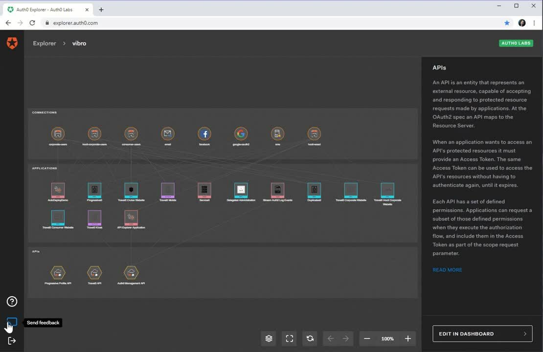
We baked an easy mechanism for you to share your thoughts directly in Auth0 Explorer: just head to the lower left button bar, hit the middle button and jolt down your experience, comments, ideas, insights… anything you want to share. I can assure you we will treasure and ponder each and every one of your messages!
About the author

Vittorio Bertocci
Principal Architect
